

Welcome to the whimsical world of branding blunders where even the mightiest of corporations occasionally slip on the proverbial banana peel. It’s a reminder that in the journey to standout branding, the road can sometimes be bumpier than a designer’s crumpled sketch paper. Let’s take a lighthearted look at some infamous design fails and what we can learn from them. Grab your popcorn (or color swatches if you’re feeling professional) and enjoy the ride!

2. The Rebrand That Made Customers See Red
Then there’s the tale of a popular beverage company that decided overnight to change its decades-old logo and can design. Tropicana decided to replace its familiar packaging, which featured an orange with a straw in it, with a more minimalist and modern design. The new packaging removed the iconic orange image and introduced a more generic look that customers felt did not stand out on shelves and made it harder to distinguish from other brands. The public response was overwhelmingly negative, and sales reportedly dropped by 20% following the redesign. Due to the backlash, Tropicana quickly reverted to its original packaging.

3. The Misguided Mascot
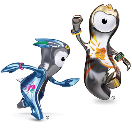
One famous real-world example is the London 2012 Olympic mascots, Wenlock and Mandeville. These mascots, intended to embody the spirit and values of the Olympics and Paralympics, were met with mixed reactions. Many found their designs too abstract and somewhat eerie, deviating significantly from traditional or expected mascot appearances. Their futuristic, one-eyed designs were meant to be innovative but ended up confusing and not particularly endearing to the general public.
In conclusion, while these design disasters may make us chuckle, they also teach valuable lessons. They remind us that design is a powerful tool that needs careful handling. At Opacity Creative Lab, we approach each project with a blend of creativity and caution, ensuring that your brand’s identity is both innovative and appropriate—no banana peels included.